01 The Challenge
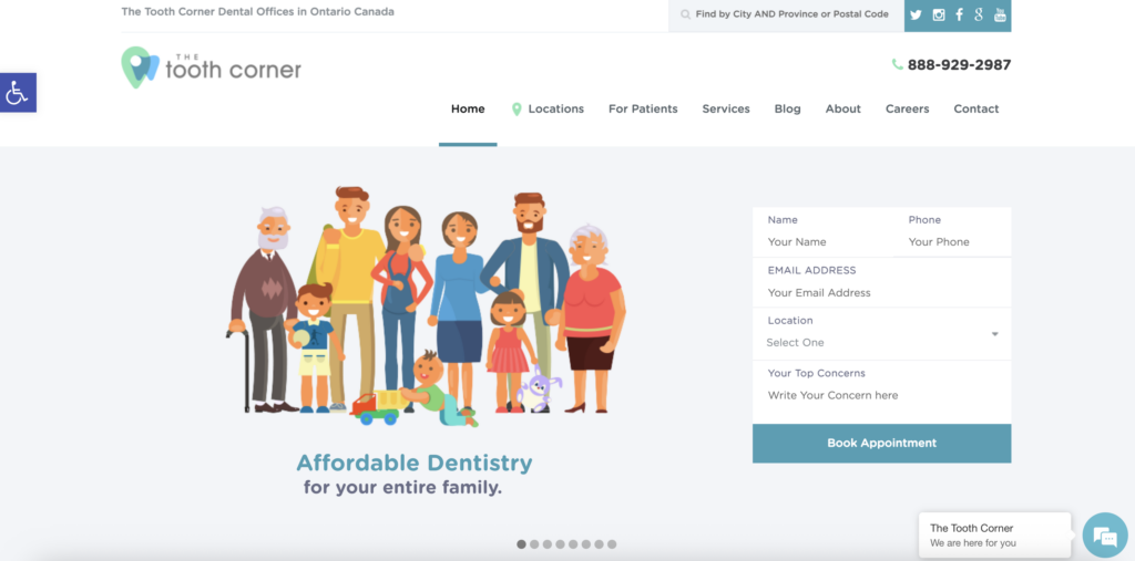
The Tooth Corner is an established dental practice with locations across Ontario, but its existing website did not reflect the scale or professionalism of the business. The outdated visual design, inconsistent layouts, and low-quality imagery made the experience feel less polished than expected from a modern healthcare service.
My goal was to create a website that felt more professional and trustworthy while making the information easier to understand and navigate.
See their current website design below:
02 Rethinking the Experience
I started by looking at how the existing website presented information and where the experience became overwhelming. Large blocks of text and inconsistent formatting made it difficult to quickly scan pages and find what mattered.
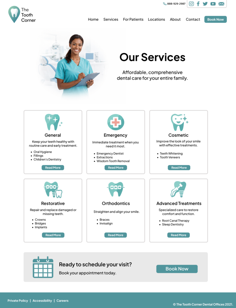
I redesigned the information structure around clear headings, shorter sections, icons, and expandable content. This allowed me to keep important information available without making every page feel overloaded.
03 Website Design
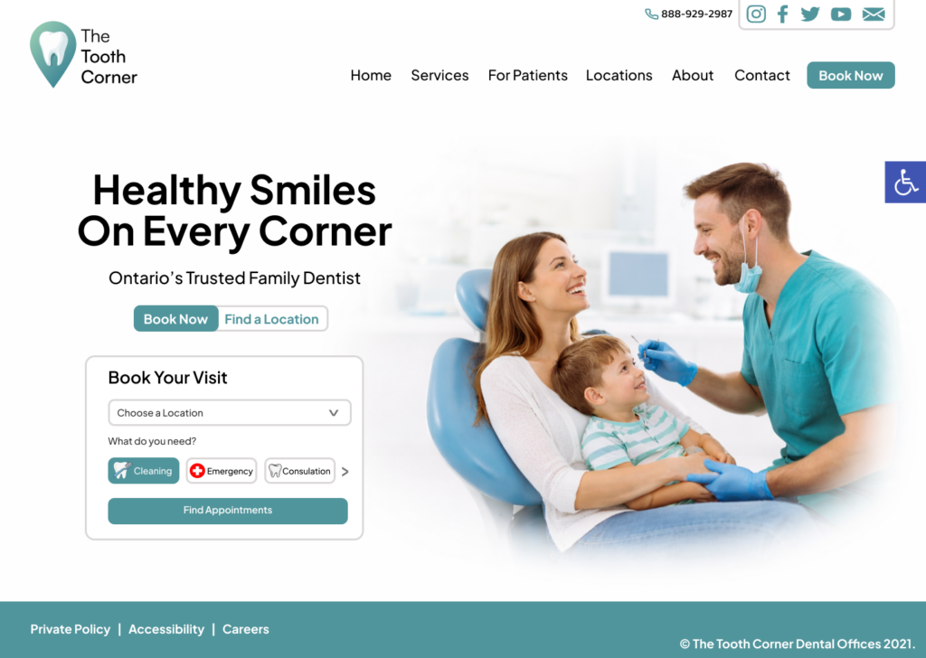
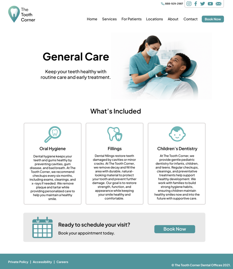
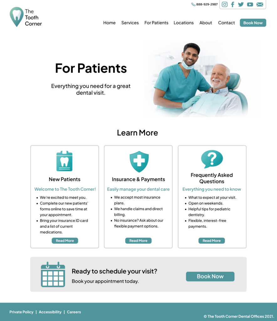
The new interface uses a consistent grid, spacing system, and visual hierarchy to create a more cohesive experience across the website. I also replaced low-resolution imagery with higher-quality visuals and redesigned the logo to better fit the new direction.
The overall design aims to feel clean and modern while still being welcoming. Rather than relying heavily on illustrations, the use of real imagery helps create a stronger connection between users and the people behind the practice.
04 Promotional Media
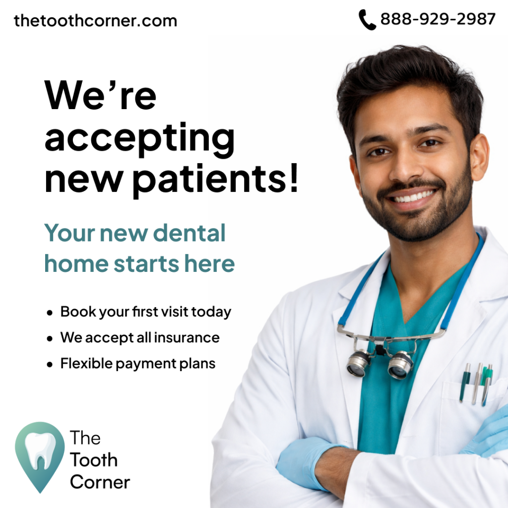
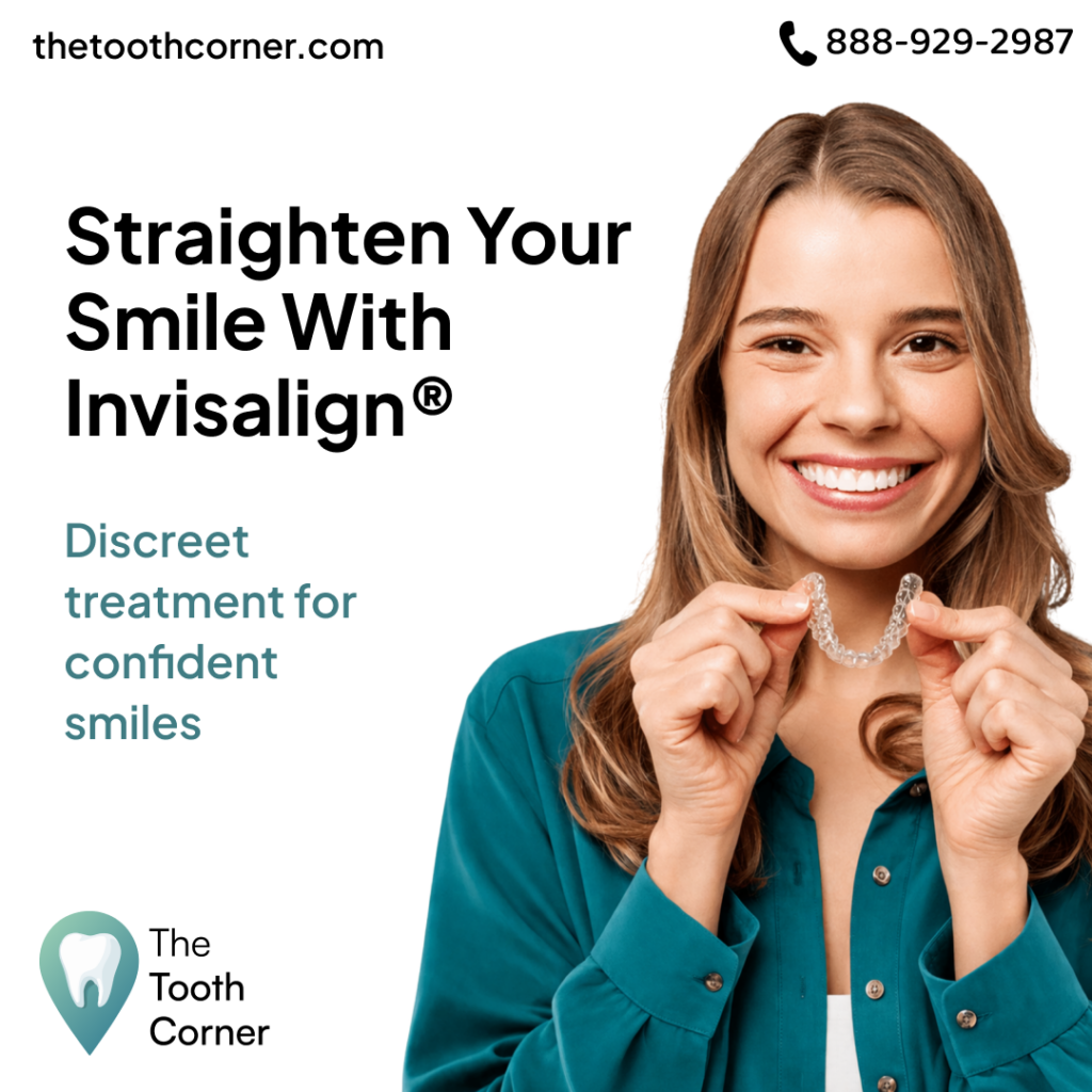
After establishing the new website direction, I extended the visual identity into promotional media. I focused primarily on Instagram ads, designing them to communicate their message quickly while directing users back to the website.
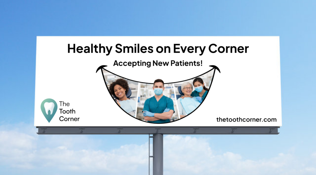
I also explored how the identity could translate to physical advertising through a brochure cover and billboard. Across each format, I kept the messaging simple, the layouts focused, and the branding consistent.

05 Final Direction
The final redesign brings The Tooth Corner into a more modern and cohesive visual direction. By simplifying the information, improving the imagery, and creating a more consistent interface, the website feels easier to navigate while better reflecting the trust and professionalism expected from a dental practice.
The promotional media builds on the same identity, giving the brand a consistent presence across both digital and physical spaces.